Fly Little Bird: The Story Behind This Dance-Inspired Painting
I started very young as a dancer.
This matters when I go looking for images of movement. I have inside knowledge of movement through dance - the repetition of perfecting technique, the energy required to perform. There's emotional power living inside a gesture that lasts only seconds. So of course I want to paint it. But I'm not trying to capture just the representation of the image. I'm after the story of the movement itself. How to capture that in a single momentary painting is what motivates my compositions. But the meaning behind the imagery? After painting "Fly Little Bird" I discovered that a painting, just like the art of improv, has its own story to tell. That story will mirror something back to me, but when someone else looks in that mirror they may find something completely different reflecting back at them.

Why I Collect Movement
I'm always looking for reference images. I have many images of people in motion, mostly women and children. I'm particularly captivated by dancers and action shots that capture something I can't quite articulate but recognize when I see it. It's the feeling I felt while performing a movement - you're not just performing a step, you're expressing a motion, a feeling. I have a photograph of two people fencing, one figure suspended in air striking their opponent. The arc of their blade and the action in their pose creates this perfect visual representation of the energy it took to land that final blow.
What I'm looking for when I collect images are not pretty poses - maybe some of them are - but more than that, they're moments where movement reveals something true about the effort and reason for getting there.
The image for "Fly Little Bird" was one I kept coming back to. It captivated me. And as much as I like painting a rendition of a good pose, I wanted to look for more in what this pose was saying to me. I don't know why it was more captivating than the several other poses I had to choose from. I just knew it was, and it held my attention.
Building the Painting
Starting with the Sketch

I start with a sketch. This one was black and white in gouache, charcoal, and white acrylic paint. It's loose and gestural with overlapping figures exploring the gesture of the pose and the juxtaposition of two repeating figures combined with another repeating visual element - circles. The idea of repeating elements is there from the start. I couldn't tell you what it represents, but there's something to be learned from it.
Taking Notes From Kline and Hofmann


This painting is built with layers.
This is where I'm greatly influenced by artists like Franz Kline (first image) and Hans Hofmann (second image). In Kline's work there's richness created by his constant layering of black over white and white over black that creates not just gesture and movement but beautiful shifts in tone. Hofmann's use of bold color and scale to "push and pull" shapes forward and back creates an illusion of space.
Typography as Structure
I mimic these two concepts while I build texture, lay down color, and experiment with composition. In between that, I projected different renditions of the word FLY in various fonts. There's one bold and structural version that created hard-edged geometric shapes across the whole canvas. This helps break up the space.
I like using elements that are blown up in size because it gives a predetermined line.
The letter A can be read as the letter A on a page, or when blown up it can be read as a triangle over a square with triangular shapes on either side. The other more decorative FLY adds character to the composition. A good graphic designer knows that typography and the font you choose can say it all.

Finding Visual Balance

These blown-up letters and overlapping shapes of the repeating figure become the scaffolding I work to build visual balance with. I filled in some shapes, let others show through as line, covered some up entirely. Some elements come forward and others are pushed back and fade into the overall texture. Every decision was about finding what worked visually.

Where the repeating figures started, eventually gets whittled down to just a few of those shapes, or pieces of those shapes.
Some versions are just outlines, some are solid in color but differing in size.
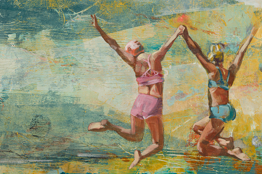
While one, the most prominent dancer, is clearly defined in front - the figure in the pink dress.
The Making Process
While I was painting, I wasn't thinking about meaning. I was thinking, "Does this look good? Is the design working? Do these colors work together? Am I making a chaotic mess with all these layers I've thrown on the canvas? What stays and what goes?"
Even if I love one little perfect piece of the painting, I have to be willing to sacrifice it if it means the overall composition gets stronger.
That's the process. And life happens simultaneously - conscious and unconscious thoughts all processing, things I'm aware of and things I'm not. It all lands on the canvas in ways I don't control and I'm surprised by.
What the Painting Told Me

I couldn't really place what this painting was about until after it was finished.
This was 2019-2020. Life was complicated in ways I couldn't articulate at the time. I was trying to find creative ways to encourage someone I loved to push beyond limitations and reach for their potential. It felt like pushing a delicate baby bird off the edge of a branch - terrifying, needed, an act of faith that they would find their wings.
But here's what the painting showed me that I hadn't consciously understood: there are two figures in motion. Not one person being pushed and another doing the pushing. Two figures, both mid-leap, both suspended in that uncertain space between ground and flight. Lead by example. You are in this together. All of those cliché sayings.
You can't help someone else fly if you're not willing to leap yourself. You have to find your own courage first, get your own act together, discover your own strength before you can offer it to someone else.
The repetition in this painting isn't just compositional. It's about patterns - in life, in behavior, in how we see the same moment differently based on what we know and what we've experienced. The same gesture viewed from different perspectives doesn't look the same. It carries different meaning depending on how you're seeing it.
That's what happens when you paint what resonates without fully understanding why. Art reflects life. If you're painting what genuinely pulls you in, it will tell you your own story back - often unexpectedly, in ways I could not have composed beforehand.
What Someone Else Saw
A friend bought this painting. A young mother with three children who had danced before kids but stopped when there wasn't time anymore.
Some time after she hung this piece in her home, I saw that she started dancing again. I went to see her perform.
I don't know for certain, but I like to think this painting gave her some motivation to return to that love. Maybe she saw something in those figures that spoke to her own story - one different from mine, but just as true.
That's what I've learned about making art that comes from genuine resonance rather than a planned-to-the-finish concept. The work holds space for multiple meanings - your story, my story, the story of whoever lives with this piece and lets it reflect something back to them.
This series, which I call WORDS, is built on this principle: paintings that hold space for multiple meanings, connecting movement to lived experience. I strive to create work that keeps offering something new - to myself and to the people who want to live with it. It's art that reflects life.
The Technical Details
"Fly Little Bird" is 30×40 inches, acrylic on canvas, from my WORDS series. The layered composition includes texture built through multiple applications of paint, integrated typography in two different typefaces, and repeated figures exploring the same gesture of leaping through the air.
The colors - teal, ochre, pink, purple, and that acid yellow-green in the background - create spatial tension similar to Hofmann's push-pull theory. Some shapes advance while others recede. The eye moves between the solid teal figure and the lighter figure in front, both caught mid-motion

Underneath all of it: layers of texture, color, hidden marks, and the ghost images of all the attempts it took to find the final composition. There's a thin veil-like wash of white paint that softens all the chaos of layering and decision-making, bringing cohesion to the overall composition.
Although the original is sold, prints are available.
If you're curious about my current work and want to see how paintings unfold from sketch to final piece, join my newsletter The Artful Journey. I share studio updates, behind-the-scenes process photos, and stories about the work as it's being made - plus first access when new pieces become available.